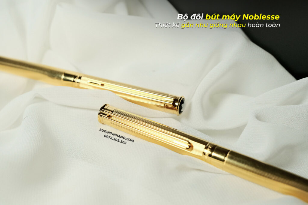
Classic pens like Noblesse are always the target of many pen collectors. Noblesse is diverse with many different designs, each design has a slight difference that if you do not pay close attention, you will definitely not notice.
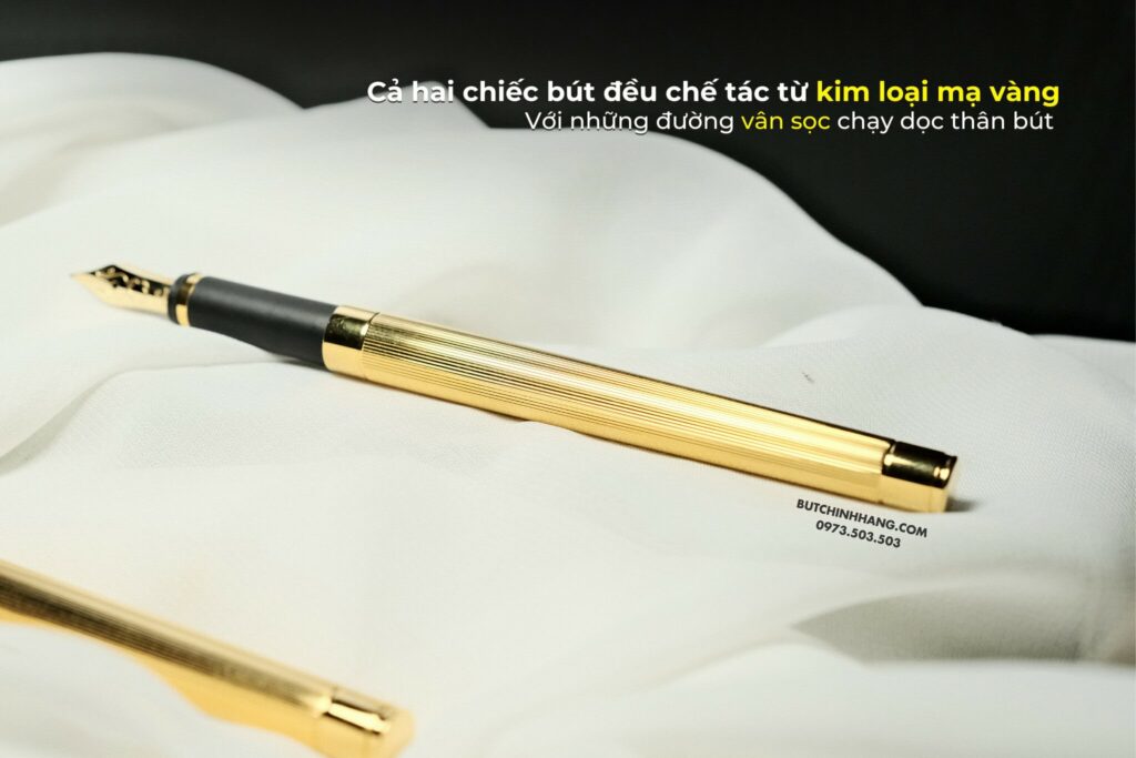
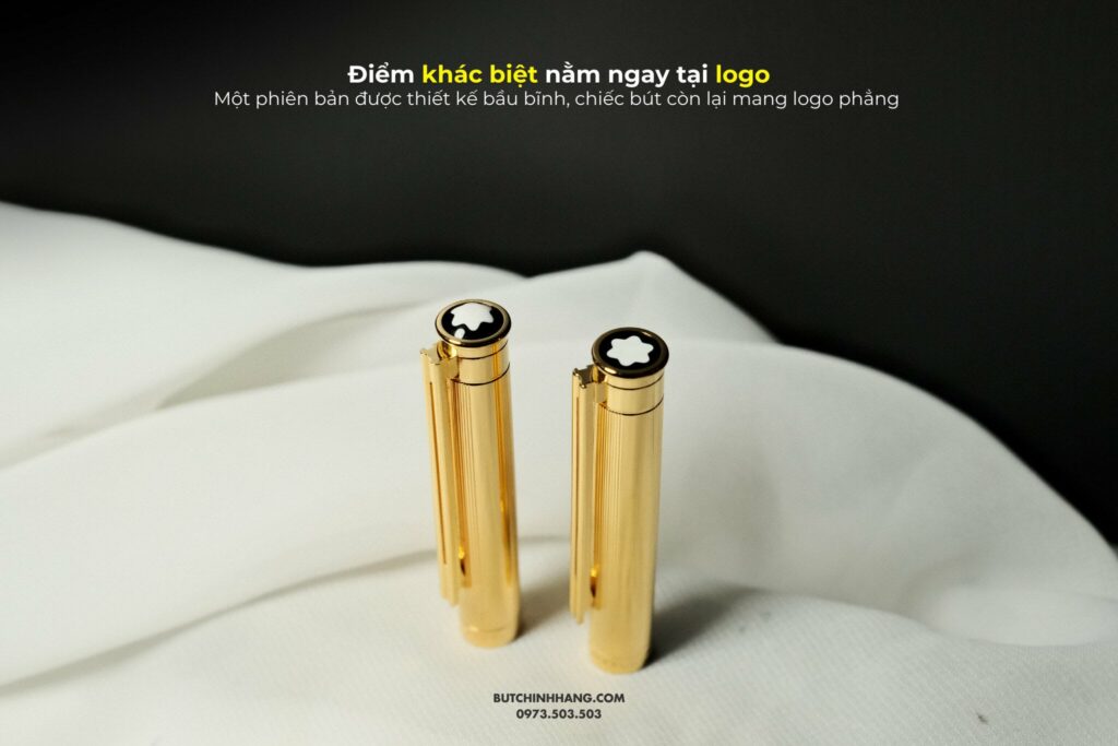
Like the two pen models you are seeing, both are made with the main material of gold-plated steel with stripes running along the body of the pen. The biggest difference between these two pens is the logo which is designed in a completely opposite way. One version is plump, cone-shaped, the other pen is crafted flat, bringing a unique difference. The word "Noblesse" is different right at the ring in the middle of the pen body, also using two different fonts that are difficult to recognize.
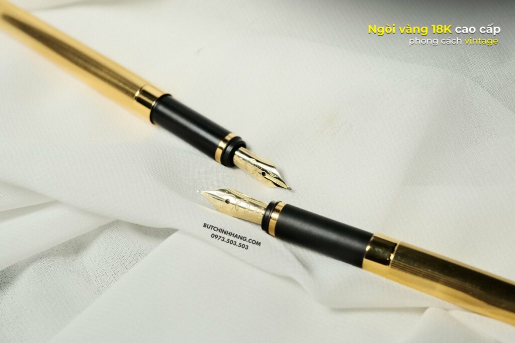
Both use the company's classic 18K gold nib design, the way the gold material is marked is also changed by the company and is not completely the same. These two pens will surely puzzle collectors a lot if they want to have all these high-end Noblesse versions.


